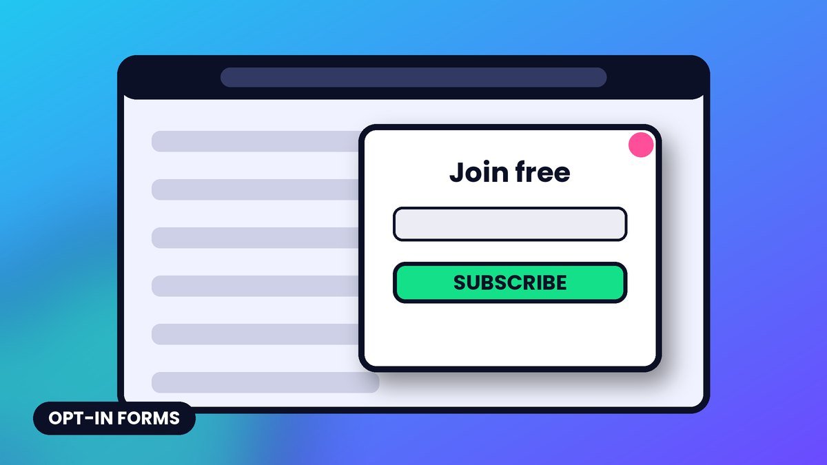
Everyone says they hate popups. Then they sign up through one. The truth is simple: people hate bad popups. The ones that ambush you in two seconds, cover the whole screen, and guilt-trip you with “No thanks, I hate money.”
A good opt-in form feels like a helpful offer at the right moment. Here’s how to build those.
Know your form types
Different forms do different jobs. Most healthy sites use three or four together.
- Inline forms: sit inside or at the end of a post. Zero annoyance, lower visibility. Great for readers who just finished something useful.
- Modal popups: appear over the page. Highest visibility, highest annoyance risk. Timing is everything.
- Slide-ins: a small box that glides in from a corner. Less intrusive than a modal, still noticeable.
- Sticky bars: a slim banner at the top or bottom. Quiet and persistent, good for one simple offer.
- Exit-intent popups: triggered when a desktop visitor moves to leave. A last polite offer.
- Content upgrades: a bonus tied to the exact post, like a checklist version of the article. Often the best-converting form on a blog.
- Dedicated landing pages: one page, one offer, no distractions. Where you send social and ad traffic.
Timing and triggers that respect people
The biggest popup mistake is showing it before the reader has gotten any value. Let them taste the content first.
- Scroll depth: trigger after someone scrolls a meaningful portion of the page. They’re engaged, so the offer makes sense.
- Time on page: wait long enough for them to actually read. A few seconds is too soon for most content.
- Exit intent: catch desktop visitors on the way out, when you’re no longer interrupting.
- Page targeting: show a recipe checklist on recipe posts, a tools list on tools posts. Relevance beats volume.
- Frequency capping: if someone closes it, don’t show it again for days. If they subscribed, never show it again.
- Click triggers: a popup that opens only when someone clicks a “Get the checklist” link. Zero annoyance, high intent.
Pro tip: Exclude subscribers from your popups. Most form tools can detect people who arrived from your emails or already signed up. Showing an opt-in to an existing Insider is the fastest way to look careless.
Mobile and the intrusive interstitial problem
Google has long warned that intrusive interstitials on mobile can hurt how a page is treated in search. Think full-screen popups that block the main content right after someone lands from a search result.
Generally treated as fine: cookie or age notices required by law, and banners that use a reasonable amount of screen space and are easy to dismiss.
Watch out: On mobile, avoid full-screen popups that appear immediately on landing. Use a slim banner, a small slide-in, or an inline form instead, and make the close button big and obvious. A tiny “x” in the corner is a thumb trap.
Copy formulas that convert
Your form has seconds to earn a signup. Clear beats clever almost every time.
Formula 1: Specific result + timeframe
“Get the 5-minute email checklist that fixes your open-rate problems.”
Formula 2: Name the pain, offer the fix
“Staring at a blank draft every week? Grab 40 newsletter ideas you can use today.”
Formula 3: Join the club
“Join the Profit Inbox Insiders. One email a week with the tactics we’re actually testing.”
Formula 4: What, how often, why
“Every Tuesday: one email strategy, one tool, one template. Free, and unsubscribe anytime.”
Then nail the details:
- Button text should describe the result: “Send me the checklist” beats “Submit.”
- Fields: ask for email only unless you’ll truly use more. Each extra field is friction.
- Decline link: keep it neutral. “No thanks” is fine. Shaming copy costs trust.
- Micro-reassurance under the button: “No spam. Unsubscribe in one click.”
Test your headline and button copy the same way you’d test a subject line. The Subject Line Tester is handy for sanity-checking short, punchy phrases too.
Double opt-in vs single opt-in
Single opt-in adds people the moment they submit the form. Double opt-in sends a confirmation email first, and only confirmed people join the list.
| Single opt-in | Double opt-in | |
|---|---|---|
| List growth speed | Faster | Slower, some never confirm |
| List quality | Typos, fakes and bots slip in | Cleaner, confirmed addresses |
| Deliverability risk | Higher bounce and spam-trap risk | Lower |
| Proof of consent | Weaker | Stronger record |
A common middle path: use double opt-in for open forms that attract bots, and single opt-in on high-intent flows like checkout, with bot protection on every form. If you use double opt-in, make the confirmation email short, obvious and branded, with a single big “Confirm my subscription” button.
Subject: One click and the checklist is yours
Hey! Tap the button below to confirm your email and I’ll send your Newsletter Launch Checklist right away. If you didn’t sign up, just ignore this and you won’t hear from us again.
Consent basics
Consent rules vary by country, so here are the widely accepted foundations.
- Tell people what they’re signing up for and roughly how often you’ll email.
- Don’t pre-tick consent boxes. Under GDPR, consent must be a clear, affirmative action.
- If you give away a lead magnet, say clearly that it comes with a subscription to your emails.
- Link to your privacy policy near the form.
- Record when, where and how each person signed up. Your platform usually stores this.
- Every email needs a working unsubscribe link and, under CAN-SPAM, your physical mailing address.
This is general information, not legal advice. Check the rules that apply to your audience.
Profit move: Tag every subscriber by the form they used. The person who grabbed your “email templates” upgrade and the one who joined from a sponsorship post want different things. Segmenting by signup source makes your first offer far more relevant.
Your popup audit checklist
- Popup waits for real engagement (scroll or time) before appearing
- Mobile uses a small, easy-to-dismiss format, not a full-screen takeover
- Existing subscribers are excluded
- Closed popups stay closed for several days
- Offer matches the page topic
- Headline promises a specific result
- Button text describes what they get
- Only the fields you truly need
- Consent language and privacy link are visible
- Bot protection is turned on
- Signup source is tagged
Key takeaways
- Use a mix of form types: inline, content upgrades, slide-ins and a well-timed popup.
- Trigger after value is delivered, and cap frequency.
- On mobile, skip immediate full-screen interstitials.
- Clear, specific copy and result-based buttons beat clever wordplay.
- Choose single or double opt-in deliberately and keep clean consent records.
Need a lead magnet worth popping up for? Browse the Profit Inbox Templates library for ready-made checklists and swipe files, then plug them into your new, less-annoying forms.
Join the Profit Inbox Insiders
Weekly email marketing plays, free tools and templates. Plus the free 7-Day Email Profit Bootcamp.